Comparing the Aesthetics of Bronze and Travertine Facades: The Residences at 1428 Brickell vs. 888 Brickell
Quick Summary
- Bronze reads warm and atmospheric; travertine reads mineral and tailored
- Miami light amplifies patina and veining, changing how towers photograph
- Street-level texture matters: entries, soffits, and podium rhythm set tone
- Choose by lifestyle: editorial glamour vs. quiet, stone-forward permanence
Why facade material is the new status signal in Brickell
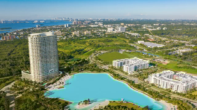
In ultra-premium Miami, the facade has quietly become the first line of brand identity. Not the logo in the lobby, not even the amenity deck-rather, the material that catches morning haze and late-afternoon sun, and how it performs from sidewalk to crown. In Brickell, where towers compete within a tight visual field, the choice between bronze-toned metal and travertine isn’t cosmetic. It sets expectations around privacy, glamour, restraint, and how a residence will feel long before you step inside.
That’s what makes the comparison between The Residences at 1428 Brickell and 888 Brickell by Dolce & Gabbana so instructive. Without reducing either project to a single finish, their visual languages still read as two distinct camps in luxury design: warm, atmospheric metalwork versus pale, mineral stone.
Bronze vs. travertine, aesthetically: what the eye reads first
Bronze, as a facade cue, reads “crafted” before it reads “mass.” Even when the underlying system is modern curtain wall, bronze-toned elements imply jewelry-scale intention-frames, fins, screens, or reveals that look designed, not merely engineered. In Miami’s shifting daylight, bronze often behaves like a filter: it warms reflections, deepens shadows, and can make glazing feel less exposed. The net effect is often intimate from a distance, even on a tall tower.
Travertine, by contrast, reads “architectural” before it reads “decorative.” It presents as a cut-stone plane with gravity and implied thickness. Even when used as cladding, it signals permanence because the eye recognizes quarry-born variation-subtle veining, pores, and tonal clouding that resists perfect uniformity. Travertine also communicates discipline: proportion, rhythm, and a tailored minimalism. It isn’t shy, but it’s rarely theatrical.
For buyers, the difference lands instantly. Bronze suggests evening culture and a curated, editorial mood. Travertine suggests daylight calm, quieter confidence, and the kind of luxury that looks better the longer you own it.
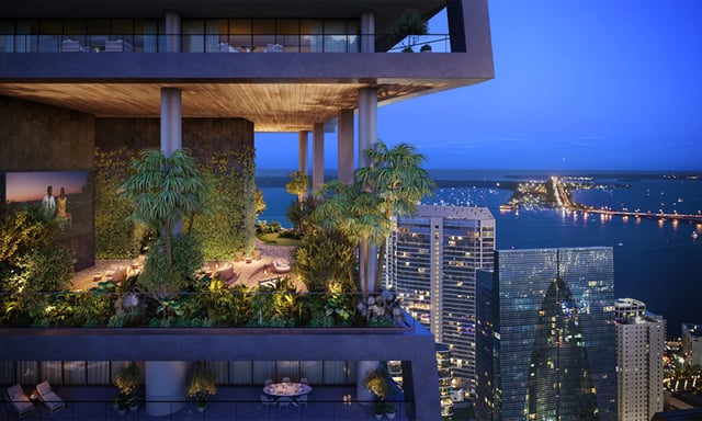
The Residences at 1428 Brickell: bronze as atmosphere and privacy
When a tower leans into bronze, it can read less like a glass object and more like an inhabitable instrument-one that modulates light. In Brickell’s urban intensity, that modulation matters. A bronze-forward exterior tends to soften the tower’s presence from neighboring high-rises and from the street, where glare can be unforgiving.
At The Residences at 1428 Brickell, the bronze narrative is best read as warm precision. The material choice implies controlled reflection and a preference for depth over brightness. Bronze-adjacent palettes often pair naturally with darker glazing, richer mullion lines, and shadowed recesses, which can visually compress the facade and make it feel more private than comparably glazed neighbors.
This is where bronze becomes a buyer-facing advantage rather than a purely aesthetic decision. A building that visually holds its interior closer-even as it rises-can feel more discreet. In Brickell, discretion isn’t only about security and access; it’s also about how much of your life reads in the skyline.
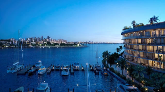
888 Brickell: travertine as monument, texture, and fashion-house severity
Travertine is one of the few materials that can make a contemporary tower feel anchored to older ideas of luxury: palazzi, galleries, grand civic buildings. In a neighborhood that can skew reflective and glassy, stone reads as an intentional counterpoint. It brings texture to the skyline, and that texture tends to photograph as “real,” even when the rest of the tower is highly engineered.
At 888 Brickell by Dolce & Gabbana, a travertine-forward aesthetic carries a distinct authority. The building appears to insist on surface and tactility, not just silhouette. Stone also shifts the emotional register of the arrival sequence. Where bronze can feel like candlelight and velvet, travertine can feel like a museum stair and a tailored coat. The message is less about glow and more about form.
In the luxury market, that distinction matters because buyers aren’t only buying a view-they’re buying a design stance. Travertine, when used well, signals composure. It implies the building doesn’t need to chase reflectivity to be noticed.
How Miami light changes both materials throughout the day
Miami is a city of glare, humidity, and hard sun that turns every facade into a performance. Bronze and travertine don’t merely look different; they behave differently.
Bronze reads warmest at the edges of the day. In early morning and near sunset, it can appear almost liquid, as if the building is lit from within. At midday, it often tightens into a darker, more graphic outline, emphasizing frame lines and shadow. For a buyer, that means the tower’s personality shifts with your schedule: brunch brightness isn’t the same as evening ambience.
Travertine does the opposite. It’s most itself in strong daylight, when mineral variation becomes legible and its matte quality diffuses glare. In softer light, travertine can look even more monolithic and calm, because the stone’s micro-texture holds enough shadow to stay dimensional. If you’re drawn to buildings that feel composed at noon as well as at dusk, stone can be the more consistent companion.
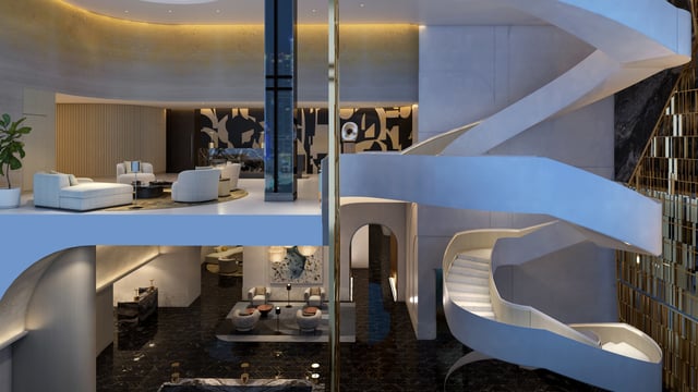
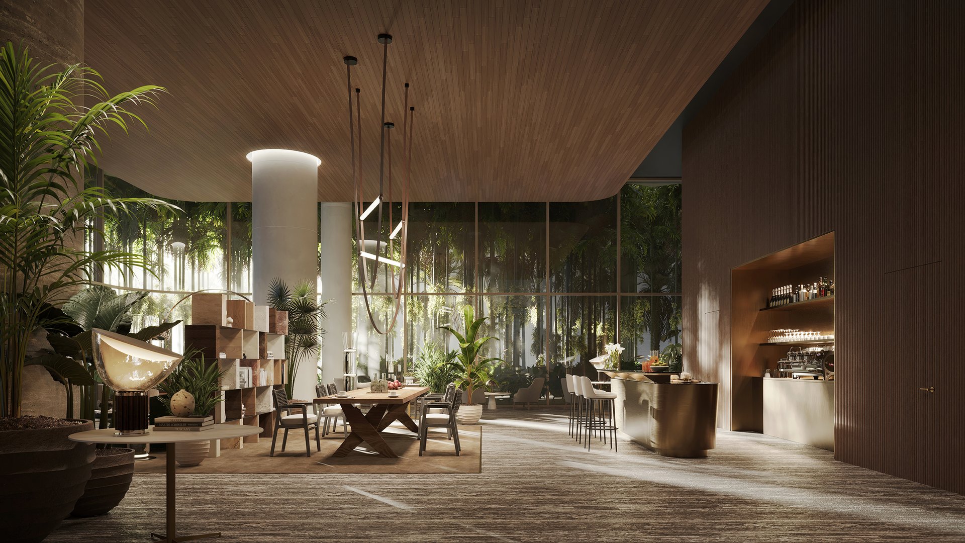
Street-level presence: the podium is where material becomes lifestyle
Luxury towers are often judged by their crowns, but lived experience begins at street level. Material decisions at the base determine whether a building reads like a private club or a public object.
Bronze at the podium tends to create a threshold effect: the eye reads a transition from bright city to darker, curated interior. Doors, canopies, and soffits can feel more tailored, especially when bronze is paired with warm lighting and darker stone floors. The implied lifestyle is evening-forward-dining reservations, art openings, a sense of controlled intimacy.
Travertine at the podium tends to create a gallery effect. Stone surfaces can make even a compact entry sequence feel spatially generous, because the material suggests thickness and calm. The implied lifestyle is day-to-night, with an emphasis on ease: a building that feels polished at 10 a.m. as much as at 10 p.m.
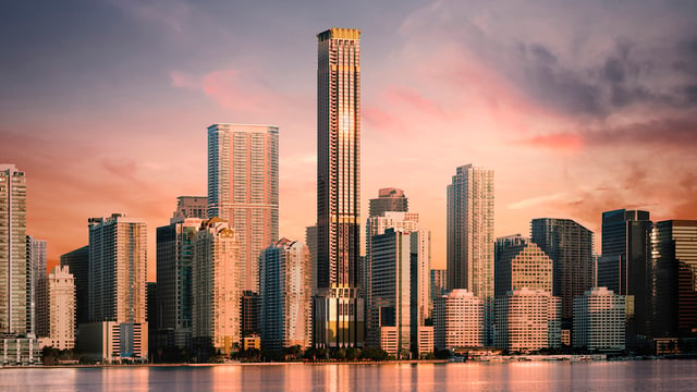
For context in the same neighborhood, Brickell’s broader design spectrum is visible in projects like Una Residences Brickell, where the exterior language leans into sculptural form and smooth continuity. Seeing these projects side-by-side clarifies a buyer’s real preference: glow and contrast, or stone and quiet mass.
Aging and upkeep, aesthetically: patina vs. consistency
In coastal cities, “aging well” is as much a visual question as a technical one. Owners don’t just want durability-they want the building to look better at year ten than at year one.
Bronze is associated with patina, which can be a virtue when controlled. The appeal is that the facade can gain depth and character rather than simply fading. A bronze-forward exterior can develop a more nuanced appearance over time, especially in how it holds shadow and softens reflections. For buyers who appreciate materials that mature, that evolution is part of the romance.
Travertine’s aging story is different. The aesthetic goal is often consistency: the stone should remain calm, legible, and refined, with variation that reads intentional rather than accidental. Travertine can feel timeless because it doesn’t rely on sheen. When it stays clean and evenly maintained, it reads as permanent-almost institutional in its confidence.
If you’re comparing the two, ask a design question rather than a maintenance question: do you want a facade that gains character, or one that preserves a steady, tailored look?
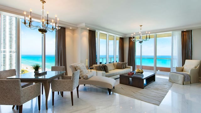
Views from inside: how exterior material can shape interior mood
Buyers rarely connect facade material to interior experience, but the relationship is real. The exterior sets the tone for how the window line feels and how the building frames the outside world.
A bronze-leaning exterior often pairs with deeper window framing and warmer exterior reflection. Even when interiors are minimalist, the outward view can feel slightly softened-less clinical. That can make a residence feel more intimate at night, when city lights become part of the decor.
A travertine-leaning exterior often supports a brighter, more daylight-oriented mood. The psychological effect is clarity. If you value crisp mornings, a clean palette, and the sense that the building is a calm container for the view, stone-forward architecture tends to reinforce that.
To see how “mood” becomes a product decision in Brickell more broadly, consider neighbors with different design theses such as Cipriani Residences Brickell, where classic cues and contemporary tower living meet. Material is never just surface; it’s a promise about how the day will feel.
Buyer guidance: choosing between bronze and travertine without overthinking it
If you’re choosing between The Residences at 1428 Brickell and 888 Brickell, the most effective approach is to decide what kind of visual energy you want to come home to.
Choose a bronze-forward expression if you want:
-
A warmer, evening-leaning identity that feels curated rather than exposed.
-
A facade that reads as crafted, with depth and shadow as primary tools.
-
A skyline presence that feels discreet and atmospheric.
Choose a travertine-forward expression if you want:
-
A brighter, mineral calm that reads tailored in daylight.
-
A facade that signals permanence through texture and restrained mass.
-
A street presence that feels gallery-like and composed.
Both are valid forms of luxury in Brickell. The difference isn’t which is “better,” but which is more aligned with your personal definition of modern grandeur.
FAQs
-
Is bronze on a facade the same as solid bronze panels? Not necessarily; “bronze” can describe tone, finish, or detailing rather than solid metal.
-
Does travertine always look traditional? No; when detailed with clean joints and modern proportions, it can read sharply contemporary.
-
Which material looks better in Miami’s midday sun? Travertine often stays calmer in harsh light, while bronze becomes more graphic and contrasty.
-
Which material feels more private from the street? Bronze-forward designs often visually deepen shadows and frames, which can feel more discreet.
-
Will these materials change the look of the skyline at night? Yes; bronze can amplify warm glow, while travertine tends to appear quieter and more monumental.
-
Is a stone facade always higher-end than a metal-toned facade? No; luxury lives in proportion, detailing, and execution-not simply the material category.
-
Do bronze and travertine pair well with modern interiors? Both do; bronze leans warm and atmospheric, while travertine supports lighter, calmer palettes.
-
If I value timeless design, which direction should I lean? Travertine typically reads more classically permanent, though well-detailed bronze can also age beautifully.
-
Are these facade choices mainly about aesthetics or lifestyle? Both; the exterior sets expectations for arrival, mood, and how the building feels day to night.
-
What’s the simplest way to decide between the two projects? Visit at different times of day and choose the material that matches your preferred light and energy.
If you'd like a private walkthrough and a curated shortlist, connect with MILLION Luxury.

Million Luxury
Million Luxury
Welcome to MILLION, an exclusive luxury real estate boutique nestled in the heart of South Florida’s most desirable locations. Specializing in high-end properties, we provide a sanctuary for discerning clients including top Fortune 500 executives, affluent families, celebrities, and professional athletes from across the globe. At MILLION, we understand the unique demands of our elite clientele and offer a seamless blend of confidentiality and personalized attention. Our commitment to privacy is unwavering; we ensure that every transaction and interaction is handled with the utmost discretion and according to stringent confidentiality protocols. Our concierge service embodies the pinnacle of white-glove care, offering tailored assistance that transcends traditional real estate support.